Tate Liverpool
22nd September 2017 – 17th June 2018
Free entry
Reviewed by Sandra Gibson
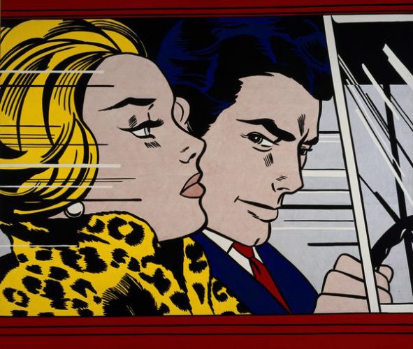
(Artwork above: Roy Lichtenstein, In The Car 1963 © Estate of Roy Lichtenstein/DACS 2017)
Roy Lichtenstein acknowledged the legitimacy of incorporating popular culture and modern materials into his work, exploiting their potential for dynamic composition, whilst also commenting on contemporary society. He took the conventions of the comic strip, with its emotionally charged narratives of romance or heroic deeds, and raised the profile of these modern-day myths. His screen print on paper, In the Car (1963) is taken from a comic strip story in a 1961 edition of Girls’ Romances. In this second, larger version he has eliminated the thought bubble, so we have to impute what is going on emotionally from the simplified cartoon faces. By enlarging the figures or faces Lichtenstein amplified the stylised drawing and the gender stereotyping. He made statements and he asked questions. For example: pulp fiction presents assumed and assigned gender roles. Isn’t this a rather limiting and unrealistic two-dimensional world in which to place our multi-dimensional aspirations? “A cartoon is a diagram of a person,” he once said.
In terms of his appropriation of the cartoon strip style, Lichtenstein chose carefully to imitate the four colours of printers’ inks, and he used Ben Day dots, a system invented to extend the range of colours available to newspaper printing. So in enlarging the images he also drew attention to such details of printing technique. Moreover, the qualities inherent in the dot and its placement, or the dynamic potency of, say a diagonal line, or the decorative possibilities of juxtaposing the same marks or different kinds of marks, could be examined and enjoyed in their own right. Lichtenstein was sometimes criticised for copying. The truth is, he didn’t make a straight copy. He left things out; he made changes, right down to the placement of individual dots. He has always stressed the importance of the positioning of the mark over the character of the mark.
“I am nominally copying, but I am really restating the copied thing in other terms.” Roy Lichtenstein
“There’s high art and there’s low art. And then there’s high art that can take low art, bring it into a high art context, appropriate it and elevate it into something else.” Bill Griffith
In enlarging images, words and directional movement lines, Lichtenstein was not just drawing attention to popular mythology and our tendency to over-simplify, he was also commenting on the seductive power of these elevated motifs and the cross-over with mind-influencing advertising techniques. These also offer a simplified, idealised world of glamour and courageous happiness. Wall Explosion (1965) examines the danger inherent in such powerful manipulation of imagery. It is a motif in enamel on steel, whose bold bright colours evoke the world of advertising, whilst the linear elements remind us of the portrayal of movement in cartoons. Here we have an explosion immobilised: an attractive, decorative, controlled rendition of something essentially vicious and uncontrolled. Interestingly, this desirable object extends its own dimensions through the shadows it creates on the gallery wall. Reflections on Crash (1990) similarly presents a dangerous event in decorative motifs. The word “crash” is even partly obliterated.
If Lichtenstein’s content and dimensional grandeur reflect something about society’s values, his choice of media complements this. He used new techniques such as screen-printing and modern materials not associated with the conventions of fine art. For example, he employed steel mesh (which also echoed the Ben Day dots he painted so meticulously) in Wall Explosion. He used lithograph screen print on paper, and metallised PVC on paper for Reflections on Crash. Water Lily Pond with Reflections (1972) is a screen print on enamel, on stainless steel reclaimed from dashboards of 20s and 30s cars. He was able to realise a swirl motif on the steel: a labour-intensive task, each swirl being executed individually. In using materials that were very much part of automotive culture, Lichtenstein was reflecting the ‘look’ of the time he lived in. Moreover, the glossy surfaces of some of these materials bounce back a collection of images, partial images and distorted images, which challenge the viewer’s self-image, and by implication the world they inhabit. The interplay of light, reflections, exaggerations, distortions and partial obliterations references the ambiguities and ambivalences of so-called reality.
Partial obliterations recur in Lichtenstein’s work. In Reflections on Conversation (1990), two talking heads are partially hidden by a diagonally decorated area, which hints at shattered glass and therefore argument. Nude Reading (1992) shows a girl reading a book held very close to her head. Is she exaggerating her absorption, or hiding? Reflections on Girl (1990) shows a profile head and a half-covered thought bubble and text. These portrayed glimpses evoke the caught moments in our own hectic lives: of other lives, of objects, of events, of movement, of appearance and of disappearance. In our age, we are used to camera-captured images but here it is the painter’s eye doing the recording.
But I think Lichtenstein is saying something more than life being a series of fleeting moments. He is saying something about the way the mind works, through perception of what is happening out there. Reflections Art (1988) exemplifies this. The word ART in large capitals is partly masked, the obliteration increasing across the three letters. We impute the word from what we see – the parts of the letters not covered. We need so few clues to write our own narrative, as I did about the girl with the book and the two heads in argument. The first point is conceptual: there are no girls, no books, no arguments. These are marks on flat surfaces. There is not even an attempt to make them photo-real. The narrative comes from minds looking and judging. The second point is about the danger of extrapolation. We all do it and it can be socially and politically dangerous. Seeing only part of something doesn’t mean we can judge the whole scenario. Popular fiction and cartoon art does not include any nuances; it is a simplified view upon which we embroider our own agenda.
All this thinking requires some respite and what I most enjoyed in this exhibition, aesthetically speaking, was the homage to Monet: Water Lily Pond with Reflections (1972) and Water Lilies with Clouds (1992), both screen prints on enamel on stainless steel. Decorative, and with a softer palette, these compositions of stylised leaves and flowers look like collages. Their stillness is complemented by moving water-light caught in the swirls on the steel.
So something for the mind; something for the spirit.
Permalink
A superb exhibition for all the reasons given by Sandy in her review. We are very fortunate to have the TATE in Liverpool. Thanks to all concerned. And thank you Nerve.