| HOME |
| NERVE |
| REVIEWS |
| ARCHIVE |
| EVENTS |
| LINKS |
| ABOUT US |
| CONTRIBUTORS |
| BACK ISSUES |
| CONTACT US |
 The
Liverpool Art Prize 2012
The
Liverpool Art Prize 2012
Friday 27th April – Saturday 9th June
Metal at Edge Hill Station
Reviewed by Sandra Gibson
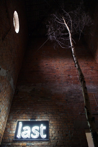
Liverpool Art Prize winner Robyn Woolston’s metaphor for a post-apocalyptic world is contained within a red-bricked room built by nineteenth century hands, a room that was part of a transport network crucial to capitalism. Today we are left with the life-threatening results of this system of despoliation, exploitation, greedy consumerism, profit and loss. There might be a certificate of excellence on the wall for “New Uses for Railway Buildings to Metal at Edge Hill a cultural destination” but we’re still doing capitalism to ourselves. We’re still doing it though some of us are trying not to.
Silver birch is one of the last trees to lose its foliage in autumn but the one in Robyn Woolston’s installation won’t experience spring’s resurrection. A dead silver birch whose brittle branches are about level with the round window (the natural light is somehow drained by the colour of the brick and the density of the building’s energy) stands at the centre of this grim mandala. It has a mulch of white plastic. On one of the walls hangs a bright white neon sign proclaiming: last in lower case, contained within unnecessary plastic which creates a reflection of the word. This is a link with manufacturing; with exploiting consumer greed; with advertising and its profligate use of materials and with the coming catastrophe. Last orders, last chance saloon, last tree on the planet…we are reminded of Eliot’s Waste Land: “HURRY UP PLEASE IT’S TIME”
The artist commissioned the sign but she doesn’t usually use new materials; the tree from Witherslack Estate, Cumbria, came from a previous installation.
When Ai Weiwei installed a hundred million hand fired and hand painted ceramic sunflower seeds at Tate Modern the human instinct to walk in them and handle them was stifled by health and safety considerations which cordoned them off and rather defeated the object. Here at Edge Hill the viewer is free to walk on the plastic, feeling its brittle crunch. The fact that the white plastic underfoot consists of thousands of disposable plastic knives and forks is interesting on two counts. Firstly it references the whole notion of eating as consuming: another self-destructive activity creating increasing numbers of obese people; secondly the so-called disposable implements are not disposable. Plastic swirls around the oceans of the world; most of it does not biodegrade. It lingers for centuries, unbalancing the delicately balanced ecology. The prolific, wasteful product upon which our capitalist system is based is choking our planet as surely as the silver birch is stifled by the white plastic that cannot nourish it.
Walking on those brittle yet resilient plastic shards is an uncomfortable experience, more sharp-shrill than crunching bones and quite high on the shudder count. If you fell you could injure yourself on the sharp edges, but it’s compelling. And that is what this installation has over a painting, a photograph, a film or a sculpture trying to say the same thing. It is this experiential moment of texture and sound that cuts across the cerebral activity.
And that is why I have written my review of “last” in the directness of the present tense.
Robyn Woolston is not sure if the planet will survive: “We put product and profit before people; we put planet last. It should be the planet first, then the people who depend on it. We’ve got it wrong. The feeling that comes to mind with regard to this is Cormac McCarthy’s book The Road which is post apocalyptic.” Just as we are feeling depressed a couple comes in. They enjoy the plastic-crunching as if they are enjoying snow. “The last crunch!” the artist comments.
The show is to close today but is that all she means?
www.robynwoolston.com
www.greenpeace.org
www.guardian.co.uk/artanddesign/2010/october/11/tate-modern-sunflower-seeds-review
Alan Dunn’s installation does not have the claustrophobic minimalism created by Robyn Woolston, nor the assault of her poetic directness. Instead there is diverse provision in his tribute to the human mind’s capacity to take a complex journey triggered by a single experience, in which a whole world of memory and detail becomes available.
In his case the Proustian moment was a bus in a tunnel. Alan Dunn put together the Soundtrack for a Mersey Tunnel while travelling on the 433 bus every day. The collection of tracks lasts 2 minutes 33 seconds: the length of time it takes to go through the tunnel. He has also compiled CDs of artists’ works on themes such as revolution, the number 4, the colour grey, and the Williamson Tunnels. He has recorded poets in the tunnels when closed and set up a choir of tunnel workers.
The audio experience at the centre of the installation provides an opportunity for the visitor to hear rare and amazing material, and to take the 433 bus CD away with them. Choosing more or less at random I listened to Alex Bellos talking about the qualities of the number four, Four Minute Warning by Null and Void, Three Cool Chicks by the 5 6 7 8s, the voice of Leadbelly introducing Grey Goose and a virtuoso guitar performance by Bo Diddley. But there was so much more and so little time - as Alan Dunn has said, the projects “take a few years to make an impact.”
Around the audio section there are display cases of related objects including a fragment from Apollo 8 which was flown round the moon in 1968. There are three photos of the 433 Arriva bus in the Mersey Tunnel, surrealised by the large scale of the tunnel, by having no driver or passengers, by looking shiny like a toy and by being curiously stationary, though some blurring of the background of the middle photo does reference movement. There are model buses, a sound track for the Mersey Tunnel, photographs of a tunnel construction crew, a Mersey Tunnel diagram from the Eagle comic 1951, a photo of Brecht’s Drip Music (1959-1962) being performed by a man on step ladders pouring water into a small tin bath; there’s a detailed examination of the word revolution, a window sill full of covers from 33rpm vinyl records, Irina Ratushinskaya’s novel: Grey is the colour of hope (1989), the August 4th page from a Chinese calendar, seventeenth century drawings of the moon, Mersey Tunnel post cards, a CD of alternative ring tones, the Smiths’ This Charming Man, a tin of grey paint, a sign for the 13th floor…
The whole installation is a mind map representing a phenomenal amount of painstaking and detailed work: a tribute to the passion of the artist and to the resourcefulness of the human mind.
So, on the one hand we have an artist inviting us to spend time on a journey of discovery that will take some time; on the other hand we have an artist grabbing our arm with a wild-eyed plea to take immediate action because the Four Horsemen of the Apocalypse are about to pay a visit. Are we going to listen to CDs while the planet burns? And this is the paradox. Alan Dunn has the optimistic view that the human mind is amazing in its capacity, perhaps indirectly implying that this capacity will include a creative solution for discouraging the men on horseback.
But will there be time?
Drawing Paper is another interactive opportunity in which the viewer is encouraged to participate in that most basic of the arts - drawing. The exhibition is a drawing room with materials supplied. Here, examples of work are displayed and stimulus material such as botanical drawings, bark, mirrors, a ram’s skull, crumpled metal, old binoculars, a box camera, part of a musical instrument with JAPAN BANJO on it, a pile of books, a model of a male torso, is available. Visitors are invited to draw something - leave their mark as it were.
Jon Barraclough and Mike Carney have curated and published Drawing Paper: an occasional free newspaper which features work from 90 local, national and international artists. There have been five issues since 2010 and copies are available as part of the hospitality. Drawing Paper honours drawing as a process as well as a product and recognizes its wide-ranging capacity:
“Drawing is such a basic human expression and yet it has the capacity to be emotive, descriptive, powerful and highly personal to the creator. It is like a conversation we can have with the world and with other people about how to see things and ideas.”
Drawing Sessions is a more recent development achieved with the support of the artist collective, The Royal Standard, where Jon Barraclough and Mike Carney are based. People meet to draw in the same space to the stimulus of music and sound - a method favoured by both artists.
It seems to me that the efforts of Jon Barraclough and Mike Carney to demystify art and encourage people to use drawing as communication is laudable, as are their efforts to acknowledge the work and make it freely accessible to other people through publication. The process is ongoing and can only be hinted at in such an installation because it is all happening elsewhere. The publications reveal a very high standard of resourceful energy, a variety of technique and approach and a wonderful sense of spaciousness. The size of the newspaper and the absence of clutter enables you to see the drawing properly.
Tomo, aka James Thompson describes his method as DIY. Poverty has always caused artists to use materials they had to hand. Picasso painted on cigar boxes. More recently poverty has been linked with the decision to responsibly recycle the plethora of waste materials all around. Tomo compares it to sampling music: using what is there and using the transformative, alchemical power of imagination and skill to produce a surprise. The mundane is all around us to be used but there are surprising things beneath the surface as Breaking Point, with its layered effect created by fly posters, illustrates. This work uses black ink and collage to create a sort of Pandora’s Box opened to reveal stylised jewels whilst colourful kites fly. It’s like an image from a child’s book, though the use of black is unnerving - a word I keep using in relation to Tomo’s art. Pink Razor, composed from ink, emulsion, masonry paint and hair on reclaimed board is another unnerving piece. It shows a razor, feminized by being pink, a foot with blood coming from it and blood swirling round a plughole, all depicted in a comic-book style. Apart from the emotions evoked by the idea of naked vulnerability and sharp implements, the unnerving thing here is the real hair round the plughole. Speaking of sharp instruments, in Script: What Lies Within (2010-2011) the artist uses ink on a reclaimed Berlin theatre script, incorporating handwriting into type. The script is in German which gives another dimension and then there is a hooded figure in black ink with a sharp implement. What reflection is that in his eyes? How much more dramatically direct the visual image is when compared with the verbal image of the writing.
These pieces have a macabre feeling of pulp fiction, a surrealist edge reminiscent of the work of Magritte, who had a passion for popular culture.
We regard the Graffiti artist as a very contemporary and revolutionary spirit - braving the authorities, accessing dangerous places along railway lines and up towers and using motifs from popular culture and the slogan-laced imagery of political power to challenge the status quo. But this artist also shows stylistic links with the past: such as the traditional wood-cut with its use of black, its dramatic decorative effects and linear focus. Death of a Lifter has resonance with those traditional depictions of martyrdom - the saint stuck with arrows. He wears a hoodie, which is a contemporary reference, but this is also a traditional garment from the middle ages.
The Business is in the Bag (2010) is a witty allusion to the fast food industry. The artist has used ink on a reclaimed Parisian McDonald’s bag, reappraising it as art with its own motifs, rendered more novel by the French language. The ironic comment references the tradition of French cuisine vis a vis the notion of packaging and advertising tactics taking precedence over substance.
The Liverpool Art Prize 2012 is a thought-provoking exhibition raising big issues, not least the role of the artist. It addresses the encouragement and survival of the creative spirit in a world that is ugly with ignorance and greed. Four of the five artists present a celebration of possibilities, the fifth uses her creativity as a clarion call because the possibilities are running out.
Sorry Comments Closed
Comment left by Sandra Gibson on 22nd June, 2012 at 12:00
The Sound of Ideas Forming is the name of Alan Dunn's Exhibition - sorry I omitted it.