| HOME |
| NERVE |
| REVIEWS |
| ARCHIVE |
| EVENTS |
| LINKS |
| ABOUT US |
| CONTRIBUTORS |
| BACK ISSUES |
| CONTACT US |
 Art in
the Square
Art in
the Square
The Gallery Liverpool
Saturday 12th to Friday 25th May 2012
Reviewed by Ben Briggs
The Gallery on Stanhope Street is a space which is intimate without feeling cluttered. Artist’s work breathes without the white-wall syndrome of bigger galleries. They are currently presenting the group who formerly displayed in Clayton Square, Art in the Square, featuring paintings, drawings, screen-prints, ceramics, textiles and more.
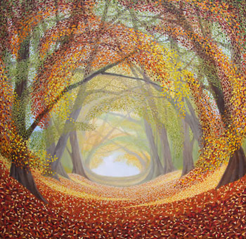
A common thread of the canvasses was reserved use of paint, and in this sense Mike Hatjoullis’s acrylic works were the odd one out, an opening eyesore for those of traditional taste. Constructivist-influenced but with looser, rawer marks, it was impressive how his architectural scenes achieved such clear perspective, one looking down on the city and others at eye level with the buildings, suggesting an illusion of intricacy with little actual detail. Conversely, Martin Jones was polished and crisp, his magnum opus priced at £1500 Princess Avenue suffering none of the surplus gloop of Hatjoullis, liveliness still gestured via the leaves, sharp contrast and organic palette. Liverpool Town Hall may be the favourite Jones for those who love painters that render photographic realism in animate hype. Lightings that cast fairytale magic upon reality made him consistent with John Pickle’s watercolours, also boasting mastery of mist, light and shadow.
Other painters were more in the impressionist mould, John Ratcliffe taking from the continent and Tony Ellis’s crowds of simple, hatted people placed in surreal settings seeming to comment on duality. Next to him was Irene Jone’s socially sensitive calligraphy, solemn images of city life, showing people with faces in hands or blacked out altogether on the tube, an empty-looking political protestor and a U.S flag among dank council estate scenery. Beyond this area there was little in the way of ‘intellectual’ art, and more pretty household art. There were odd treats tucked unjustly in the corner. This included more from Jones, his psychedelic Noveau Cat and a grungy looking man giving us his two fingers, creatively adorned with monstrous finger puppets, Joanne Boon Thomas also worth the visit for those interested in Picasso’s blue period. The most avant-garde painting would come down to Adam Edwards’s not-so-pioneering stretched figures forming geometric compositions, and Deborah Butler’s square blocks of oil paint that create an almost mosaic effect, arguably suffering from dingy colours in the palette. It is safe to say although there are some reasonable abstract offerings, the exhibition is most rewarding for fans of elegantly finished figurative and landscape paintings.
The best of the rest included Peter Philips’s large rhino and Ann Beare’s The Allerton Oak, both muscular, virtuous pencil drawings. Beare also glorified leaf prints into talisman, appealing to those of superstitious disposition – in long, thin frames, they admittedly make slick, brooding wall hangings. Mary Campbell’s calligraphy plays with perspective, churches crouching in warped scenes. Her Metamorphosis I and III use cold blues to depict a strange beast on stilts, the distorted limbs consistent with her twisting of imagery, the creature having a Marvel comics-esque quality. Mixed media came from Cathy Turner, who uses textiles and paint. Her colours were potent, however the felt hangings do feel like they could have been worked into more incessantly, lacking the layers of elaborate detail that takes this type of work to a higher star. Sandra Hepworth’s stitched decorative pieces perhaps had more character, or possibly it was the less immediately tangible content.
Conclusively, Art in the Square does have remarkable diversity of media with enough remarkable skill on display to counter the lack of modern or innovative approaches. The curators should be praised for their use of the space, though a reshuffle may keep the fleeting bohemian visitor enthralled rather than contented.