| HOME |
| NERVE |
| REVIEWS |
| ARCHIVE |
| EVENTS |
| LINKS |
| ABOUT US |
| CONTRIBUTORS |
| BACK ISSUES |
| CONTACT US |
Carl Fletcher - The Gappalioness Monkey Project
 Upstairs
at the View
Two Gallery was the creative output of Carl Fletcher on display. Collages,
3D sculpture, 3D graffiti and paintings filled four walls and beyond,
it required a well considered overview, you couldn't simply pop in and
try to take it in quickly - there's just no way! I know because I tried
a quick overview before my interview with Carl.
Interview and photographs by Redskye 3/10/2013
I have to state that I'm biased as I've already been drawn in and co-opted by Carl's creative rage against Western consumer capitalism. Carl's artwork can be viewed on two levels - the visual and the symbolic. Combined they hit a sweet-spot in some of the finest anti-capitalist propaganda I've come across.
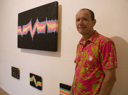
The first work on display that I wanted to ask Carl about are the four 'flash crash' paintings on one wall as they're very eye catching and being Carl there had to be something deeper going on with them.
"Looking at the four pictures which have the pre-titles 'flash crash' dare I ask is this about some financial crash?"
Carl: "Absolutely!"
"Does everyone get that - or is that just me?"
 Carl:
"No, not everyone gets it... I'm a big fan of Max Keiser who's on
Russia Today and he's a financial guru, basically he describes how a 'flash
crash' comes about through algorithms. Algorithms are numbers which are
pumped through computers at unbelievable speeds, almost the speed of light
really, if not faster, and they make these absolutely stunning colours
on the [screens of] computers. When everything is working that is a typical
sort of algorithm that's working 'AOK' and then all of a sudden you have
a crash, and that crash can actually mean the wiping off of billions,
if not trillions of wealth on Wall Street or the City of London or generally
round the world. I came to the conclusion that it looks like space really
with the black screen and you've got this beautiful light firing through
with all its wonderful information of different commodities. But when
that crash happens the impact is unbelievable, we seem to have speeded
up time, the damage we can do on Wall Street and the City of London is
just incredible. I just thought well I'll have to sort of create something
from that - which is your typical flash crash which is in front of you
now.
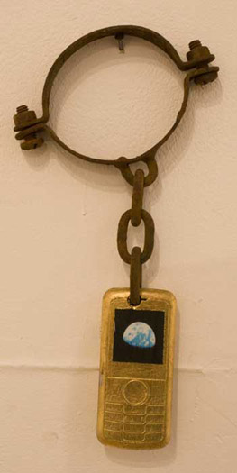
There's another piece 'mobile slave' that catches my eye and says so much about modern British society. An anonymous logo free mobile phone painted gold with a photograph of the world stuck on its display dangled from a rusty slave's ankle cuff. To me it sums up the personal obsession many, especially young people, have with mobile phones - seemingly our entire world contained on a palm sized piece of technology and which we have almost completely enslaved ourselves to.
I wanted to ask Carl about 'White Storm' another recurring theme in many of his collages.
Carl: "The White Storm project came about six, seven years ago when I came back from working in Spain. I happened to see this drink called 'White Storm' in the gutter and I couldn't believe a drink would be allowed to be called 'White Storm' in a so called country of culture, where we have so many different creeds of people and yet this drink White Storm extra strong cider with this magnificent red flash or bolt of red lightening, whatever you want to call it. I just thought it's something interesting to do. I do like media, the idea of advertising. Andy Warhol recognised that advertising is art and art is advertising and if it's presented correctly it can be absolutely really powerful. Now why would you name a drink 'White Storm' can only white people drink it, does it cause a storm in your head. You look it up in a dictionary under storm and it describes -I've actually used it in my artwork- storm a country, you can have a brain storm, you don't go away to sea if there's a storm, you have stormy emotions. Everything pertaining to storm doesn't really bode well. They've actually changed their label, I don't know if it's through me, but they've changed their logo now. If you look this is the original White Storm logo with the flash, but you've got all these colours, like the colours of war. You've got silver for metal, you've got white for innocence, you've got red for blood and you've got black for the darkness in our souls. As you can see the new White Storm is sort of totally toned down, you haven't got this SS insignia. You've got an actual drawing of a bolt of lightening, it doesn't look half as sinister as this one here does it? It really doesn't! It's actually got a blue background. So whether they've taken heed of my… there was a speaker in the Albert Dock just after the riots, August 2011, and I went to the seminar and gave him two pieces of my artwork, and he said [man from Guardian] 'yeah I quite liked them' and within six months the label had been changed.
 |
In passing the art on display might at first appear unimportant or insignificant, however on closer inspection the artwork is visually, socially and politically challenging on numerous levels. This is creativity and deep thought turned into art with many pieces either a symbolic statement or a full on rage against the system.