14th July – 18th November 2018
Walker Art Gallery, Liverpool
Free entry
Reviewed by Sandra Gibson
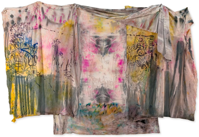
(Image above: Jacqui Hallum’s The King and Queen of Wands (2017))
The initial scan of any exhibition gives a general impression. Four out of five of this year’s winners have figurative, narrative and metaphorical content, and on the whole, this permeated my experience of the event.
Jacqui Hallum’s The King and Queen of Wands (2017) is the winner of the 2018 John Moores Painting Prize. The artist uses inks on layered cotton, creating a soak-through of the layers, where there will be chance effects arising from, and co-existing with, the more controlled primary marks. The draping suggests a courtly kimono: famous for the protocol of its many layers; there is also a theatrical effect from the curtaining, indicating places beyond. The central part, between the king and queen, has a light source in the distance which the artist calls, “an atmosphere”. Here is the place of uncertainty and possibility, yet there are specific references: Tarot cards, mediaeval woodcuts, leaded glass and art nouveau drawings. Time passes; the colours once were brighter, the grey blackly distinct; the cards will fall again and there will be further versions of courtly intrigue and magic rituals. For its strong narrative and visual metaphor of layered history, and the assertion that deliberation cannot control the chance effects of an action, The King and Queen of Wands is an effective communication.
Joseph O’Rourke’s Giants (2017) represents the night city, with its lit dwelling-cells, ancient wall and dominant river. The giants of the title seem mostly unthreatening in their parallel existence. Do they watch, impassively? Do they represent the icons of our god-drawn imaginations or our celebrity-obsessed culture? Do we respond to the lonely yearnings of the night-city, or the giants? In terms of night’s mysteries, Gary Lawrence Kos’s Town Paradise Hotel Front Terrace (2016) is a more sensuous experience. Darkly unfathomable, with catches of moonlight, and sumptuous like velvet, it has a magical quality partly created by the absence of people, who by daytime will throng the terrace.
In Tom Howse’s naïve, dreamlike, The Thunderous Silence of your Presence (2017), the water nymphs, incorporated into the liquid flow, are barely perceptible and the decorative takes precedence over the narrative: stylised trees becoming an integrating rhythmic motif against the water flow, ever-changing, ever-present – an anomaly echoed in the oxymoronic title.
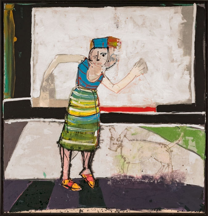
There is narrative potency to Shanti Panchal’s The Divide Beyond Reasoning (2017), which succinctly presents the balance of power within a domestic situation. Compositionally speaking, the interior space at the top is prominent yet undifferentiated, so we are not distracted by the details of domesticity, and therefore focus on the figurative interest in the bottom two thirds of the pictorial space: a physical and emotional triangle. A man holds a dog protectively; both are positioned higher than the woman; literally and metaphorically, the humans don’t see eye to eye about the dog. Because the strong status of the home has been compositionally established, one senses its capacity to incorporate an additional emotional tension. So: a visual poem in its concentrated economy, something also found in Aleyn Fears’s My Favourite Chair (2017). Exuding confident domestic ease, whilst asserting territorial rights, its bright colours and stylised patterns also welcome.
Marta Bakst’s existential metaphor, I Still See You on the Horizon (2017) references contemporary issues, such as our anxiety for our planet and the march of artificial intelligence. The only warmth perceived among the cold colours is a red rose, just out of reach of the screen-faced robotic figure. Jo Bruton’s stylised and ritualistic Tassel Talk (2016) references mutual destruction using the strange motifs of computer games.
Morgan Wills’s Leadlight Silhouette (2017) holds a similar sense of unease to Bakst’s painting. Figurative shapes, flat and black against the grid structure of the window, create a dense threat, whilst in the background coloured lines, hurriedly sketched, suggest frenetic movement. Are the aliens laying siege whilst we are distracted by the fairground? No. The alien presence is huge; the clamour beyond does not distract.
Some narratives span time. Emma Talbot’s Intense and Remote Connectivity (2017) is an Eastern-influenced creation of two banners with linear patterning and drawings of yogic motifs such as one has found, since the diaspora of ancient Eastern cultures in the late Sixties, in alternative therapy clinics. Other narratives happen in the mind. Questions of Silence (2017), Emma Fineman’s mindscape, addresses decision-making. Its subterranean background of inky blues and black intensifies the bright pinks in the figure, in which the two eyes have been differentiated, the lips and ears emphasised. Then there is a dunce cap shape on top of the head. So the dichotomy between senses/emotion and intellect is crudely implied and the interplay between the two will produce the decision.
In one tranquil scene, Matthew Krishanu’s Mission School (2017) invokes the theme of colonialism. Eleven pupils are looking at a Christian religious painting; one looks away. Another easel has nothing but chalk dust: implying that beside faith, the other aspects of education are expendable and transient. The rapacious behaviour of the colonialists was dignified under the guise of ‘civilising’ indigenous people into Christianity, a process which eliminated the existing cultures of those subjugated.
Olivia Norris’s Loose sugar, fade to black, bread makes you fat (2017) also has an economically conveyed scenario. Two figures are luridly lit, as if in shop windows, against a perfunctory street scene. One is kneeling and lifting weights: an allusion to the health industry, and the other is smoking: an allusion to self-gratification and addiction. The point is that both aspects of our self-loathing tendencies are part of the same: the human form objectified – on display. Alex Hain’s similarly themed, but less impactful urban portrait of an obese perambulatory diner, Consumer (2017) is an image for our Pound Bakery times.
Other figurative pictures portray intimacy and pleasure: a foil to the pervasive alienation found elsewhere. Laura Lancaster’s Untitled (2017) evokes the works of Manet and Degas in a space enclosed by dim light; David Lock’s El Munira (2017) creates the indolence of a private space on a warm afternoon, decoratively framed by vegetation; Andy Barker’s Nowhere to Go (2017) reveals two figures conversing in a sort of tree-house and is reminiscent of the experiential framing of Howard Hodgkin, and Gareth Cadwallader’s Milk (2017) is a short story captured in the private cameo of a man drawing in spilt milk.
The figurative painting I most enjoyed was John Kiki’s Bud Girl (2009 – 2017), in which a girl moves against a stylised background. The painting seems unfinished: there are sketch lines, parts of it are less clearly defined and, as implied by the dates, revisited. The dynamism of this work comes from the contrasting black and white, the liveliness of colour in her clothing, the kinetic effect of simultaneous heads, and from the unfinished, altered state of the work. The effect is process rather than ultimate product.
Billy Crosby’s prize-winner, Quilt (2017), is a large trompe l’oeil painting which simulates the warp and weft in fabrics. We have neither quilt nor fabric but a painted facsimile of woven wood in brown, orange and yellow. Unyielding – the opposite of pliable comfort – it’s an uncomfortable view: the brash colours only relieved by the corroding copper coins at the interstices of the weave. Defying our expectations, this surreal object evokes the work of Claes Oldenburg. Other pictures containing uncomfortable surreal objects include Tom Dawn’s slightly disturbing Hollow (2017) and Jake Clark’s Circus (2017) which encapsulates the in-your-face density of slapstick, or even snooker. Less sinister is Virginia Verran’s Black Star (2017), which combines elements from Klee and Tanguy in an airy fantasy world of comic book motifs and board-game references.
More aesthetically pleasing than any of these is Mark Osborne’s subversive and tactile Untitled Pink (2017). There are a few constructions which confuse because of the lack of context. Pete Clarke’s doubt and distance … of lost content (2017) presents an ambivalent image of construction/deconstruction against an indeterminate background and the lack of context in Steve Payne’s Unnamable(sic) (2017) creates surreal presence.
Cara Nahaul’s effective theatrical metaphor, Inches of Dust (2016) uses blocks of heightened colour in a stylised, story-book garden. Is the stability of paradise threatened or supported by the diagonal red pole? All could come tumbling down, since our survival does indeed depend on a few inches of dust. An equally successful metaphor is Sinead Ni Mhaonaigh’s Monument (2016), a non-specific commemoration comprising a pile of grey stones, which communicates, in the careless hastiness of the brushwork, exasperated weariness, such as one might feel on Armistice Day. In Carla Busuttil’s surrealistic satire against trophy hunting, Trophy for a Dull Man (2017), the sickly pale green man absurdly tries to take on the persona of the animal by ‘wearing’ it.
Lucy Sani’s untitled Bunting (2017) raises an important artistic issue: being adequate to the task. How to convey light-heightened colour and movement? Mere bunting comes nowhere near the celebratory zeal of fireworks, but then, neither do mere paintings of fireworks. Here the medium conveys the message, but not the experience. Lara Davies raises the issue of indirect exposure to the work of an artist in Me Reading Philip Guston Retrospective in the Studio (2017). You can only see part of the right hand side page of the open catalogue in her painting, indicating how much is missing in reading about something rather than experiencing it directly. Conceptually speaking, Peter Matthews’s Suspended Aura (2016-2017) is more intriguing. As with John Kiki’s Bud Girl, it seems unfinished. The top part has a lot of empty canvas – apart from the words Sunset over Pacific – and the bottom part has colours whose diagonal delineation might suggest the forward movement of a ship. This desultoriness raises questions: is this a sketch? Has the painter abandoned a cliché? Is this an acknowledgement of artistic powerlessness? Is the artist celebrating the viewers’ capacity to experience and impute so much from minimal marks and the suggestive power of words? The extent to which the mind thus yearns to write its own scenario is measured by how busily it tries to define Leo Holloway’s Untitled: an enigmatic, unidentifiable object, or Alistair Payne’s (D)welling (2017) which has an intriguing title and gives no contextual clues.
Like Billy Crosby’s painting, Liz Elton’s One Hundred Harvests (2017), in water miscible oil on a hundred compostable food bags, is also quilt-like, but less disturbing, more ethereal and generally more beautiful. Deeper colours mix in with pastels; there are colour-resist areas and overlapping; there is textural interest in the creases where pigment accumulates; the work is irregularly pieced together. This sense of mobility is enhanced by the intentional impermanence of the material: as it decomposes, so will the art work. Peter Matthews presents a deliberately ‘incomplete’ piece whereas Liz Elton presents something designed to move from completion to deliberate degeneration. Bill Stewart’s Tree Airplane Trap (2017) disappoints at first: an aeroplane caught in a budding shrub could be a cliché for the clunky entanglement of machine and nature. More importantly it’s an illusion created by scale and angle of vision. The artist’s capacity to create something that looks real but isn’t, has ramifications for everyone involved in image creation.
Emma Fineman raised the dichotomy of emotions/heart and intellect/head and there are paintings in the exhibition which nourish one over the other. Conceptual works, such as Tree Airplane Trap, Sunset over Pacific, Miraj Ahmed’s refined Smile, which evokes Magritte’s famous statement, Ian Homerston’s enigmatic, ambiguous Untitled (2017), and Clare Gasson’s Note-taking September (2016) which addresses lucidity, obviously engage the intellect because they deal with art’s big issues, such as perception, communication and ambiguity. I would place Charlie Franklin’s tiny landscape Flatland (2017) with this conceptual thread because although it does what it says on the tin: flat horizon; no contours, for me the biggest issue is its size. Why do I want it to be as big as a Rothko? There’s a whole noble tradition of miniaturist art: someone carved a whole cathedral out of a tooth, for heaven’s sake. No doubt it requires sophistication to get those exact colours and convey exactly that stillness and some talented jurors voted for this tiny painting, so who am I to object when it has so successfully provoked a response from me? It’s easy to exclaim, “I could do that,” when probably one couldn’t. I still don’t know whether size matters!
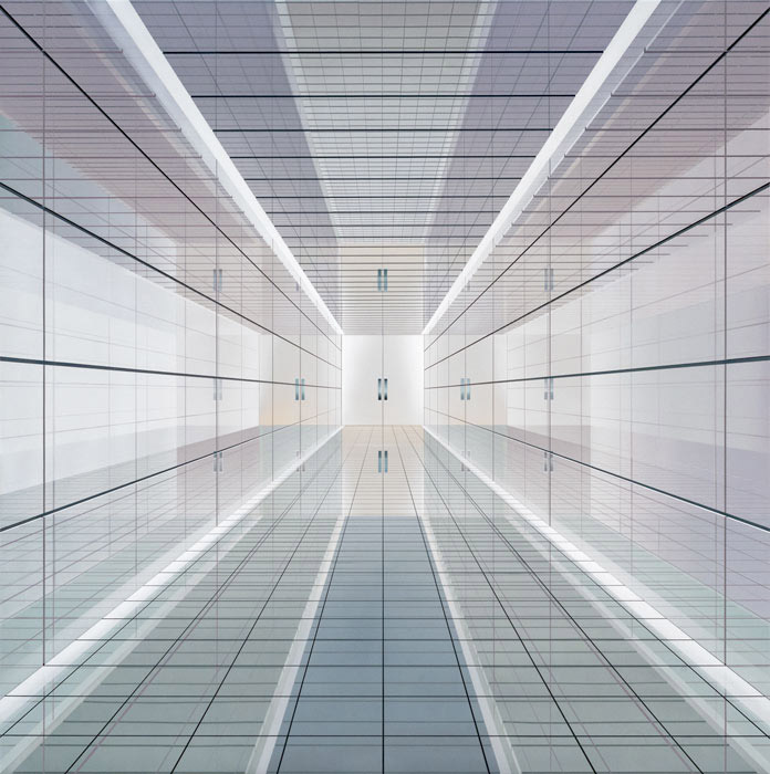
Other work engages the intellect because of its technical prowess. Ben Johnson’s The Space Between Revisited (2016) is a hymn to illusionist art, a hyperreal creation of a reflective space whose function is not defined. Graham Martin’s photo-realistic depiction of a rain-reflected utilitarian space, Red Road (2016), is equally awesome in its technical execution. Liz Bailey’s balanced, rhythmic study of stultifying uniformity, No Ball Games (2017), also resembles a photograph but the absence of people, such a feature in the two previous works, is here alleviated by the narrative provocation of the forbidden ball. Seungjo Jeong’s Interface L3 (2017) is a convincing facsimile of a building component: so precise, so uniform in its colours, it appears machine made. If James Bingham were a Seventeenth Century Dutch painter, he would be painstakingly painting velvet or lace or porcelain. His small abstract Shere (2017), comprised of diagonal lines and triangular spaces in black, greys, yellow and beige gives a sense of shifting substantiality. The same meticulous technical control is to be found in Nicholas Kulkarni’s kinetic Misdirections. One could claim that Richard Baker’s cupboard 2 (2017) is semi-abstract. At first glance it resembles a catalogue photograph of well-designed functionality in the Bauhaus style that has influenced so much of our contemporary design, but the echoing background of blues, greys, beiges and yellows incorporates the cupboard into an abstract painting.
Then there are paintings which primarily appeal to the senses and emotions. Clare Thatcher (Feature of Landscape 2017), Tomoya Matsuzaki (Untitled Willow 2017), Joanne Robertson (Raining on Shoebox Cove 2016) and Kathryn Maple (Alone in the Desert 2017) all create some ravishing colour and textural experiences, sometimes verging on the abstract. I particularly responded to the sophistication of Tomoya Matsuzaki’s palette of chalky greys, browns and beiges, the criss-cross textures reminiscent of peeling bark, and the natural elegance of nature contained. Damilola Oshilaja creates an unexpected feeling of nostalgia with Landscape Redux; No –nVOID/26: IDARIKA, The Land & The Sky (2015-2016). This ordinary scene provokes emotion through the cold, remote effect of the colours, which evokes those seaside postcards every family has kept from past relatives. Joanna Whittle’s surreal Rain Tent (2017) is equally evocative: the accuracy of grey/green English summer fetes; the wetness emphasised in watery reflection; the dismal cosiness of canvas. But not depressing like David Pearce’s Greenhouse (2017): an image of comfortless dereliction supported by dark colours. The lack of contextual detail, and the suggestion of a building within a building, creates a troubled mindscape.
In contrast, Nicholas William Johnson’s sensuous work, The Intolerable Strangeness of Vegetable Consciousness (Sunspilt II) (2016) raises the heartbeat with its potency of vegetative growth. Delphine Hogarth’s nostalgic French Summer (2017) – redolent of Matisse – charms with its decorative power and showcases a cradle telephone, potent as Proust’s madeleine, awakening that lost époque before the mobile. There’s further nostalgia in Laurence Noga’s Deep Blue Filtered Silver: a colourful re-creation of seaside vernacular, complete with precipitous steps. Equally sensuous, though abstract, is Gracjana Rejmer-Canovas’s Electric Landscape (2017) painted in blue/black oil on aluminium. Because of its density, black is a powerful, static experience but there is movement in the directional pull of the brush, exposing the aluminium and creating depth, structure and linear contrast. There is also vitality in the brush strokes of Jahan Gerrard’s expressionist painting Aerial (2017), where a turbulent sky dominates some dispirited trees. Frances Aviva Blane’s portrait Mother (2016) effectively creates a chaotic, dangerous, tumultuous energy, the linear busy-ness getting between viewer and sitter: a convincing experience of a force-field against the world.
So that’s it: sixty paintings in the sixtieth year of the John Moores Painting Prize. Someone wrote recently that figurative work is the little black dress of the art world and I think that’s right: reliable and timeless. Though we enjoy having our mind stimulated, we all like to be told a story.
http://www.liverpoolmuseums.org.uk/walker/johnmoores/jm2018/