Walker Art Gallery, Liverpool
Until 1st March 2020
Reviewed by Ashley McGovern
Trust artists to go ahead and wrench the monkey’s paw. Recognition is difficult in the art world, and household prizes offer a quick way to distinction. But with the glory of first place, catalogue columns and new commissions comes the risk of losing the untouched talent.
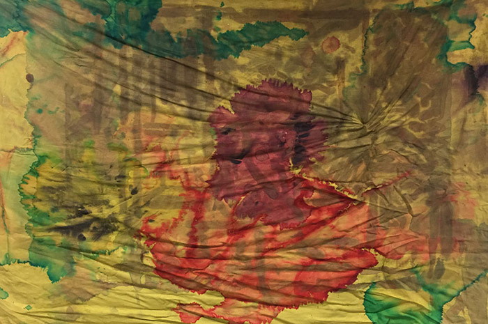
That’s what we have with the small Jacqui Hallum exhibit at the Walker. I liked her John Moores Painting Prize winner, King and Queen of Wands (2018). The ‘painting’ was in fact three cotton sheets covered in splotches of muddied ink. Her feeling for murky, dissonant colour was excellent, and she proved, in a novel way, that there’s an art in the hanging. The three sheets were overlapped and pinned to the wall with careful carelessness so as to look like an open altarpiece. Colours sank into the gaps made by the sagging material; the weight, if you like, of colour was one with the greater, anxious heft of tradition. Hallum won and the plaudits followed.
In addition to the £25,000 prize money, the JMPP winners now get an exhibition. They are let loose in the city and told to divine a new suite of work. The Walker’s generosity is merely a type of sanctioned second novel syndrome. You can see Hallum scrambling for ideas about because she’s offered her notebooks. There’s clippings of medieval sculpture, Leon Bakst’ opera scene watercolours, Andre Derain portraits, snaps of Liverpool.
We’re told that she was particularly inspired by the tomb of William MacKenzie in Rodney Street, that strange Masonic pyramid that’s a boon to ghost hunters and folklorists.
It’s possible she’s fallen in too deep with the barmy mythography. These new set of sheets are garish, incoherent and lacking the technique of her winning piece. No sense of composition remains, and the cotton pieces are used like flat, thoughtless collage rather than weighty wall-bound entities.
Hallum has said she takes inspiration from medieval sculptures and Art Nouveau illustrations. There’s no trace of that here. We’re told her process is one of accumulation, spilling and casting colour across the studio until ideas emerge. Again this is misleading, the new work is clearly too manipulated – the precision of the circular shapes gives off the sense of tacky acid trip posters.
Word of advice: don’t take the monkey’s paw; the scratch scratching on the door of diminished talent will haunt you.