| HOME |
| NERVE |
| REVIEWS |
| ARCHIVE |
| EVENTS |
| LINKS |
| ABOUT US |
| CONTRIBUTORS |
| BACK ISSUES |
| CONTACT US |
Gathering Light: International Contemporary Glass
 Metropolitan
(Catholic) Cathedral of Christ the King
Metropolitan
(Catholic) Cathedral of Christ the King
7th June - 28th August 2008
Reviewed by Sandra Gibson
“We hope to dispel any remaining notions that stained glass is an art-form of a bygone age…The show highlights artists who trained in traditional stained glass but who are now interpreting this heritage using contemporary language. The work demonstrates the spectrum of artistic possibilities of contemporary decorative glass.”
Chris Bird-Jones, Senior lecturer at Swansea Metropolitan University, Exhibitor and organiser of Gathering Light.
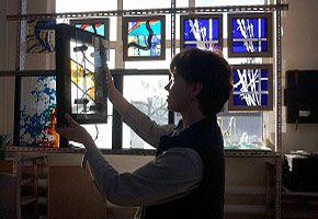
The Metropolitan Cathedral, completed forty years ago, contains a magnificent collection of twentieth century stained glass including works by artists John Piper, Ceri Richards and Margaret Traherne. The link between the Gathering Light exhibition and the Metropolitan Cathedral is that four of the exhibitors - Cedar Prest, Doreen Balabanoff, Linda Lichtman and Helga Reay-Young - trained with Patrick Reyntiens, who realised John Piper’s designs for the Lantern. Although this link is pleasing and holding a glass exhibition in a place radiant with the stuff seems a good idea, in reality the scale is all wrong and the painting-sized works are dwarfed and swallowed. Such an exhibition deserves a discreet room away from the large-scale distractions of this wondrous cathedral, away from the incongruous presence of Sean Rice’s bronze statue of Abraham and the two rows of cathedral windows in bright greens and yellows. This consideration aside, the work is well worth focussing on if you can be single-pointed.
Harnessing light to colour and form, stained glass windows gave an additional spiritual dimension to the didactic function of the traditional cathedral and this luminosity of spiritual experience is examined by a number of the artists. Greening the Labyrinth by Cedar Prest expresses ‘veriditas’ – a word used by the mystic Hildegard of Bingen to describe the soul bursting into new life when united to God’s spirit. The circular labyrinth in the glass is based on one placed on the floor of Chartres Cathedral circa 1200, providing another traditional link. The piece expresses well the burgeoning of spirituality, transcending the labyrinthine machinations of temporal mind. Different in tone, though also having a spiritual aspect is Doreen Balabanoff’s In the Early Morning Light. The image of a tree, three times framed, echoing the concentric lines of age within, is central to this meditation on longevity and impermanence. The artist’s fondness for it and her knowledge that the tree is dying adds a poignancy whose elegiac edge was increased by the fact that the light behind the glass panel was out at the time of viewing. In contrast Galon Lan [Pure Heart] by Catrin Jones is gold-edged and flecked with joyful movement. The title refers to a childhood hymn and the words acid-etched here have been deliberately obscured to indicate a sense of knowing and not-knowing, the artist being non-Welsh-speaking. Yet the not-knowing is transcended by joyful as the musical notes dance above: rich and celebratory like birds in ecclesiastical paintings. Drawn to the Light by Chris Bird-Jones uses elemental shapes and materials and a basic abrasive technique with float glass and mirror to address the notion of instinctual searching, evoking those vast oceans of time and evolution of which we are the product. The shapes in Mimi Gellman’s elegant two-toned work, The Soul Loves to Swim go further into abstraction, into the depth of being and becoming to the ‘transitional phenomena’ in the black ‘shadowland where the deepest thoughts emerge.’
Some exhibits are concerned not so much with the inner landscape of spiritual quest but with the individual artist’s interaction with the physical landscape. On the Great Ocean Road by Amber Hiscott depicts remorseless light on a primeval landscape experienced in Australia: ‘darkness captured in an isthmus of copper shadows, isolated by the searching sun.’ A spatial sense is created by having the foreground copper, the middle ground etched a misted copper, the top white and the thing textured by squiggly lines through which shines the searching light. Liverpool Red by Sigridur Asgeirsdottir takes us to a hidden ‘landscape otherwise unknown to us.’ This work, referencing its relationship to its sea-faring location in two ways, uses a red colour [inspired by Liverpool Football Club] with white superimposed fragments, ‘inspired by maps of the seabed that are created by the echo of ships on the sea that measure the depth of the bottom.’ Sometimes the relationship between the artefact and it origins is very basic, very direct. In her diptych Blue Skying Mary Mackey has taken the shape [reminiscent of the primitive shelters monks used to make] from a window in the oldest part of Cork and the material from glass salvaged by a friend. The sandblasted and enamelled result ‘about dreams and imagination’ has a dynamic geological presence brought to order by the central line.
Yoshi Yamauchi’s Memories of Australia is a strongly designed panel in yellow and brown inspired by Aboriginal work. A piece also entitled Memories of Australia by Marie-Pascale Foucault-Phipps uses colours and cultural motifs as well as the means of expression from an Aboriginal source in this vigorously executed work. The artist has painted with her fingers and used twigs taken from the environment which is also present in the lead greys, warm browns, the root and bark textures and the image of the quiescent Dreamtime ‘snake’ – part abstract, part decorative and part figurative - she has taken from local mythology. A similarly direct sense of the texture of environment is to be found in Chinks Vere Grylls’ Let There be Peace on Earth and let it Begin with Me. Paradoxically unearthly, it seems to be either a landscape of the inner world or an alien world of metallic reds and pinks – a place of layering and erosion through which not much of the light can penetrate. Yet it is there. Ellen Mandelbaum’s Outback Ancient Grasses, a golden work full of elemental movement, inspires by its spontaneity, its celebratory force, the artist’s hand imitating the movement of the grasses. ‘Photo – now set in gold-coloured mica gilding to honour the poetry of these ancient Australian trees and shadows. My hand swirled around built the mica up near the edge of the image, set up shiny metal-leaf near the lower left edge.’
Two pieces of glass work that are designed primarily to have a utilitarian function are Pohutakawa by Holly Sanford and A Study in Paper by Helga Reay-Young. The former is site-specific; its design, taken from the red fluffy blooms of the indigenous tree, combines the opaque, the transparent and the decorative to give privacy without sacrificing spaciousness. The latter demonstrates how the lighted colours of overlapping papers used with simple float glass can give decoration and privacy.
The only item in the exhibition overtly resembling the traditional notion of stained glass work is Ginger Ferrell’s Window 21, a creation of decorative formality, its colour choice and structure reminiscent of art deco, its linear quality reinforced by the use of lead. Form exactly matches the subject here: the overlapping squares referencing the structure of the kimono and the kiln-formed dogwood leaves and stencilled background giving a light and gracious decoration. Beauty contained and enhanced by its containment. Another work notable for its formality is Random Flag One by Christine Triebsch. This powerful and richly coloured piece in bronze and red and black rendered more concrete by the apparent use of rivets and regimented lighting has a political statement about the artifice that is nationalism. At the other end of the spectrum we have Cornelia Konig’s ‘I like your texts,’ a study about human communication at a personal level. The ideas are skilfully expressed using the immediacy of an actual text message and super-imposed images which create a pattern one on the other, this decorative theme continued by leaves etched over and unifying the whole.
Similarly unique to this exhibition is Sachiko Yamamoto’s Gold Leaves which celebrates the reflective qualities of glass as a medium. The composition is formal without being rigid, using beads of gold and clear glass to create a mosaic ‘to define the beauty of the glass.’ The process has been interactive, involving others in the celebration by using accessible techniques, special facilities and non-poisonous chemicals so that clients and volunteers could safely contribute to the end product. It is touching to think of the beads holding so many reflections.
The use of glass as a medium for art work invites contemplation on the qualities it offers beyond traditional painted canvas, the most obvious thing being its allegiance with light. It is interesting, therefore, that some artists in this exhibition had experimented with inhibiting its influence thus provoking aesthetic and psychological responses in the viewer based on expectation. Another point of interest was the chance effect created by the reflective surface when extraneous light hit it. In Ellen Mandelbaum’s Outback Ancient Grasses, reflected purples and blues complemented the gold, setting up an unintended resonance. Transparency offers possibilities of layered effects and the illusion of space and depth as well as decoration.
It’s appropriate to end on a topical note. Linda Lichtman’s A Liverpudlian Dream is about the artist’s relationship with the city. With its enthusiastic use of bright colour in a structure based on the segmented shape of a football it captures the life and passions and humour of the city that Linda Lichtman first visited in 1974, thought about for thirty-four years then revisited in 2008.
Comments:
Comment left by chris bird-jones on 25th October, 2008 at 0:24
thank you for this review. Can the Sandra Gibson please contact me. Thanks Chris